fbpx

Peak Performance Resources for Leaders by Leaders

Tag: Charts > Graphs

Where People Eat The Most Sugar & Fat

Before you take health, diet, and wellness advice from a country you may want to consider what they are marketing to you! Check out the below charts that outline how much sugar and fat people consume per day.

Fat is not the cause of obesity and diabetes, overconsumption of sugar and carbohydrates is!

Here is the fat consumption by country:

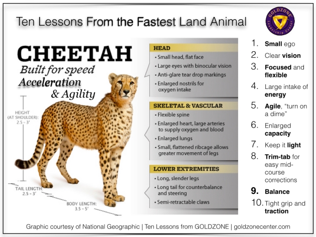
Ten Lessons From The Fastest Land Animal

Cheetah Ten Lessons.001

* * *

Stay in touch via FREE MyGoldzone Newsletter > SUBSCRIBE NOW

* * *

© Goldzone Education. All rights reserved.

Has The Economy Hit Bottom Yet?

bottomyet

This graph is very interesting (from The New York Times). It shows the price-to-earnings ratio and gives us hope for the future as well as some relief that the bottom is not far away – if not here already. On the other hand, you can see that there is a possibility we will get to the lows of the 20’s, 30’s and 80’s – which means more pain on the way.

DOW Jones Over One Week Versus Six Months

dowjones_oneweekvsoneyear

Check out this chart!  What I find interesting is that the one-week view of the Dow Jones Industrial Average looks very similar to the six-month view. The chart shows a slow decline, then a cliff, then a slow decline again. The down trend looks at first glance to be very similar.

Some conclusions:

  1. All data must be read within a larger context.
  2. Patterns are clearly repeating.
  3. The trend appears to be downwards.
  4. Have we hit bottom yet? Tell me when you figure that one out!

Powered by Goldzone & Site by Andrew John Harrison

0